H5C3J Learning Note Session 2 Episode 1
Just a treehouse course note.
Selectors
type selector
1 | h1 { |
class selector
1 | .main-header{ |
id selector
1 | #primary-section{ |
Attributes selector
1 | input[type=“text”]{ |
Pseudo-classes
1 | a:visited{ |
About margin and padding
Margin is the space outside the element.
Padding is the space inside the element.
Border is the frame between Margin and Padding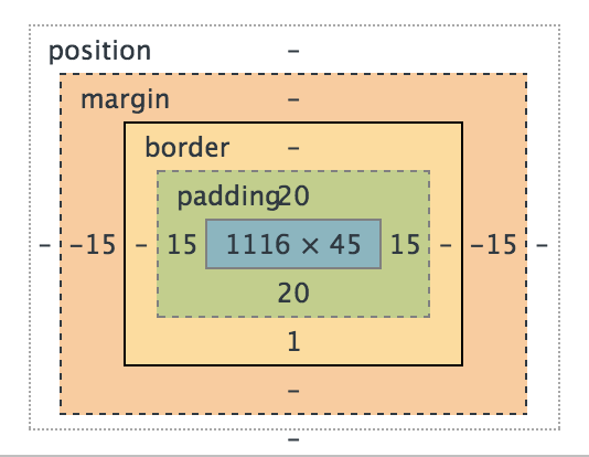
Length unit
px
Relative to the viewing device.
For screen display, typically one device pixel (dot) of the display.
For printers and very high resolution screens one CSS pixel implies multiple device pixels, so that the number of pixel per inch stays around 96.
# em
This unit represents the calculated font-size of the element. If used on the font-sizeproperty itself, it represents the inherited font-size of the element.
# rem
This unit represents the font-size of the root element (e.g. the font-size of the element). When used on the font-size on this root element, it represents its initial value.
Layout
float
make the element jump out of the basic flow layout, and be float aside of the parent container.
1
2
3
.resorts {
float: right;
}
# Best way to clear float group
1
2
3
4
5
.group:after {
content: "";
display: table;
clear: both;
}
# background-size
1
background: #434a52 url('../img/bear.jpg') no-repeat center /cover;
or
1
2
background: #434a52 url('../img/bear.jpg') no-repeat center;
background-size: cover;
Media queries
1 | .resorts { |
1 | .group:after { |
1 | background: #434a52 url('../img/bear.jpg') no-repeat center /cover; |
1 | background: #434a52 url('../img/bear.jpg') no-repeat center; |
1 | @media (max-width:1024px){ |
Make iphone display page in correct way.
1 | <meta name="viewport" content="width=device-width"> |